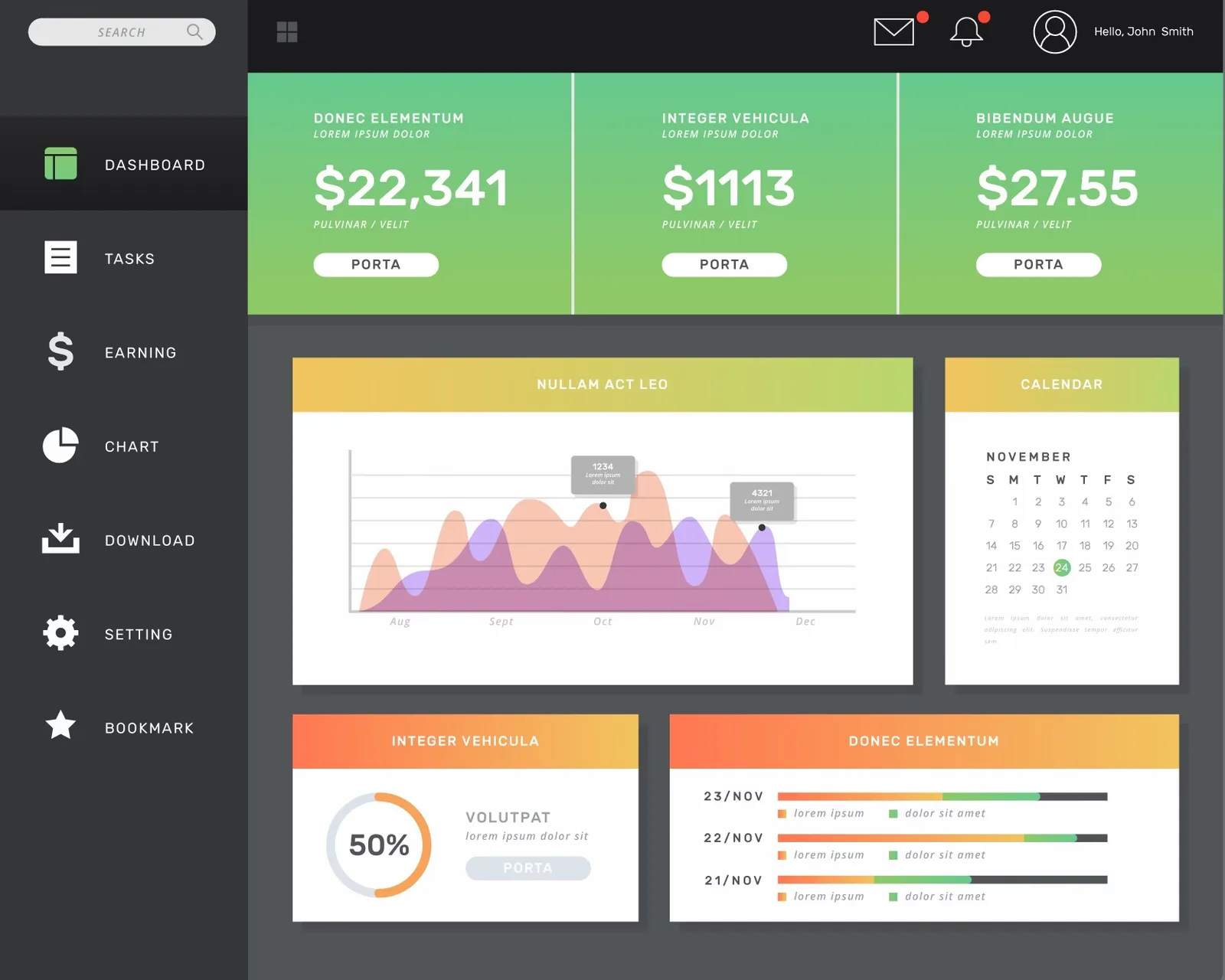
Well-designed web app dashboards can transform the way organizations understand and act on their data.
In today’s data-driven world, dashboards have emerged as powerful tools for visualizing and interpreting complex information, enabling businesses to make informed decisions and drive growth. However, creating effective dashboards is an intricate art that requires a delicate balance between aesthetics, functionality, and user experience.
In this guide, we explore the nuances of user interface (UI) design for dashboards, data visualization techniques, user experience (UX) considerations, and emerging trends that are shaping the future of this dynamic field.
So, fasten your seatbelts and get ready to embark on a journey that will elevate your understanding of web app dashboard design and equip you with the knowledge to create compelling, data-driven experiences that captivate and empower your users.
Understanding the Essence of Web App Dashboards
Before delving into the intricacies of dashboard design, it’s crucial to grasp the fundamental purpose and essence of web app dashboards. These powerful tools serve as centralized hubs for displaying, analyzing, and interpreting critical data, enabling users to gain valuable insights and make informed decisions.
The Role of Dashboards in Data-Driven Decision Making
Dashboards play a pivotal role in data-driven decision-making by presenting complex information in a clear, concise, and visually compelling manner. By consolidating key performance indicators (KPIs), metrics, and data visualizations into a single, cohesive interface, dashboards enable users to quickly identify patterns, trends, and outliers, ultimately driving informed and strategic business decisions.
Bridging the Gap Between Data and Usability
While data is the lifeblood of dashboards, usability is the linchpin that ensures the effective communication and interpretation of that data.
Effective dashboard design strikes a delicate balance between presenting data in a visually appealing and intuitive manner while ensuring that the information remains accurate, actionable, and tailored to the user’s specific needs. By bridging the gap between data and usability, well-designed dashboards empower users to extract meaningful insights and make informed decisions with confidence.
The Art of User Interface (UI) Design for Dashboards
User Interface (UI) design is the cornerstone of crafting compelling and intuitive web app dashboards. It’s the visual language that guides users through their data-driven journey, ensuring a seamless and engaging experience.
Data Visualization: Transforming Numbers into Narratives
“A good visualization should invite the viewer to think about the substance rather than about methodology, graphic design, the technology of graphic production, or something else.” – Edward Tufte
Data visualization is the art of transforming complex numerical data into visually compelling and easily digestible representations. From charts and graphs to heat maps and infographics, effective data visualization techniques enable users to quickly identify patterns, trends, and outliers, empowering them to make data-driven decisions with confidence.
Renowned data visualization experts like Edward Tufte and Alberto Cairo emphasize the importance of balancing aesthetics with functionality, ensuring that visualizations not only captivate the viewer but also accurately convey the underlying data and its nuances.
Designing for Clarity and Cognitive Load
In the realm of dashboard design, clarity and minimizing cognitive load are paramount. Users should be able to grasp the essential information at a glance, without being overwhelmed by visual clutter or unnecessary elements.
By adhering to principles of minimalism, thoughtful layout, and judicious use of color and typography, designers can create dashboards that are visually appealing, intuitive, and effective in conveying complex data in a digestible format.
User Experience (UX) Considerations for Web App Dashboards
While UI design focuses on the visual aspects of dashboards, User Experience (UX) design encompasses the entire journey users take when interacting with these powerful tools. It’s the strategic orchestration of every touchpoint, ensuring a smooth, intuitive, and delightful experience.
Personalization and Customization
One size rarely fits all when it comes to dashboards. Users have diverse needs, preferences, and goals, necessitating a high degree of personalization and customization within dashboard design.
By allowing users to customize the layout, visualizations, and data sources displayed within their dashboards, designers can create tailored experiences that align with individual preferences and workflows, ultimately enhancing productivity, engagement, and overall user satisfaction.
Interactivity and Responsiveness
In today’s fast-paced digital landscape, users expect dashboards to be interactive and responsive, enabling them to dig deeper into the data and uncover valuable insights with ease.
By incorporating interactive elements such as filters, drill-downs, and real-time updates, designers can empower users to explore data dynamically, enabling them to uncover hidden patterns, test hypotheses, and make data-driven decisions with confidence.
Emerging Trends and Best Practices in Web App Dashboard Design
The field of web app dashboard design is constantly evolving, driven by advancements in technology, shifting user expectations, and the ever-increasing demand for data-driven decision-making. To stay ahead of the curve, it’s essential to embrace emerging trends and best practices that are shaping the future of this dynamic discipline.
Mobile-First and Responsive Design
With the increasing prevalence of mobile devices, designing dashboards that are optimized for both desktop and mobile platforms has become a critical consideration. Responsive design principles and mobile-first approaches ensure that users can access and interact with dashboards seamlessly, regardless of the device or screen size.
By leveraging responsive techniques, designers can create dashboards that automatically adapt to various screen sizes and resolutions, providing a consistent and enjoyable user experience across all platforms.
Storytelling with Data
While dashboards excel at presenting data in a visually compelling manner, the true power lies in their ability to tell compelling stories that resonate with users and drive actionable insights.
By leveraging techniques such as data hierarchies, visual cues, and narrative structures, designers can transform dashboards into powerful storytelling tools that guide users through complex data sets, highlighting key insights and enabling them to make informed decisions with confidence.
Gamification and Engagement
Gamification, the application of game-like elements and mechanics in non-game contexts, has emerged as a powerful tool for enhancing user engagement and motivation within web app dashboard design.
By incorporating elements such as progress bars, achievements, leaderboards, and rewards, designers can create dashboards that tap into users’ intrinsic motivations, encouraging them to explore data, set goals, and strive for continuous improvement.
Conclusion
In today’s data-driven landscape, web app dashboard design has emerged as a critical discipline that bridges the gap between complex data and actionable insights. By mastering the art of user interface (UI) design, data visualization, and user experience (UX) considerations, and embracing emerging trends, designers can create dashboards that captivate users, drive engagement, and empower data-driven decision-making.
As we look to the future, the demand for intuitive, interactive, and data-driven experiences will only continue to grow. By staying ahead of the curve and embracing emerging technologies, design principles, and best practices, the field of web app dashboard design will continue to evolve, shaping the way businesses leverage data to drive innovation, growth, and success.
Whether you’re a seasoned designer, a business leader, or a data enthusiast, understanding the intricacies of web app dashboard design is crucial for unlocking the full potential of your data and creating truly impactful digital experiences.
Frequently Asked Questions About Web App Dashboard Design
What is a web app dashboard?
A web app dashboard is a centralized interface that displays and visualizes key performance indicators (KPIs), metrics, and data from various sources clearly and concisely, enabling users to gain insights and make data-driven decisions.
Why is web app dashboards important?
Web app dashboards are important because they provide a single, consolidated view of critical data, enabling users to quickly identify patterns, trends, and outliers, and make informed decisions based on data-driven insights.
What is the difference between UI and UX design for dashboards?
User Interface (UI) design focuses on the visual aspects of dashboards, such as layout, color schemes, and data visualization techniques. User Experience (UX) design encompasses the entire journey users take when interacting with dashboards, ensuring a smooth, intuitive, and delightful experience.
What are the key components of effective Web App dashboard design?
Effective dashboard design typically includes clear data visualization, intuitive navigation, customization and personalization options, interactive features, and responsiveness across different devices and screen sizes.
What is the role of data visualization in Web App dashboard design?
Data visualization plays a crucial role in dashboard design by transforming complex numerical data into visually compelling and easily digestible representations, such as charts, graphs, and infographics, enabling users to quickly identify patterns and insights.
How can interactivity enhance dashboard usability?
Interactivity can enhance dashboard usability by allowing users to explore data dynamically, filter and drill down into specific areas of interest, and uncover hidden patterns and insights through interactive features such as hover-over tooltips, clickable visualizations, and real-time updates.
What is the importance of mobile-first and responsive design for dashboards?
With the increasing prevalence of mobile devices, mobile-first, and responsive design are essential for ensuring that dashboards are accessible and usable across various screen sizes and platforms, providing a consistent and enjoyable user experience regardless of the device.
How can customization and personalization improve Web App dashboard effectiveness?
Customization and personalization can improve dashboard effectiveness by allowing users to tailor the dashboard layout, visualizations, and data sources to their specific needs, preferences, and workflows, ultimately enhancing productivity, engagement, and overall user satisfaction.
What is the role of storytelling in Web App dashboard design?
Storytelling plays a crucial role in dashboard design by transforming data into compelling narratives that resonate with users and inspire them to take action. By leveraging techniques such as data hierarchies, visual cues, and narrative structures, designers can guide users through complex data sets and highlight key insights.
How can gamification enhance user engagement with dashboards?
Gamification can enhance user engagement with dashboards by incorporating game-like elements and mechanics, such as progress bars, achievements, leaderboards, and rewards. These elements tap into users’ intrinsic motivations, encouraging them to explore data, set goals, and strive for continuous improvement.
What are some common types of dashboards?
Common types of dashboards include sales dashboards, marketing dashboards, analytics dashboards, financial dashboards, healthcare dashboards, and operational dashboards, each tailored to specific industries and use cases.
What is the role of real-time data in dashboard design?
Real-time data plays a crucial role in dashboard design by providing users with up-to-the-moment information, enabling them to monitor and respond to changing conditions quickly and make timely, data-driven decisions.
How can dashboard design improve organizational decision-making?
Well-designed dashboards can improve organizational decision-making by presenting complex data in a clear, concise, and visually compelling manner, enabling users to identify patterns, trends, and insights more easily, and make informed decisions based on data-driven insights.
What are some common challenges in dashboard design?
Common challenges in dashboard design include data overload, lack of user-centricity, poor navigation and usability, and failure to align with business objectives and user needs.